March 2026
Evolution of Lectr
I recently checked out every tagged release of my reading app, took screenshots of each one, and laid them all out on a single page. If you've built and shipped anything, you probably already know everything in this post. I certainly did, in theory. The uncomfortable part was seeing how consistently I failed to apply what I knew, and the useful part was understanding what actually closed the gap.
View the full screenshot gallery →
This is the story of how Marginalia became Lectr, not because of some grand vision, but because I didn't remember to check the App Store before I picked the name. More broadly, it's about the gap between knowing the right way to do things and actually doing them that way. That gap didn't close because I read more about design or studied more UX principles. It closed, slowly, because I used my own app enough to get irritated by the things I'd shipped, and eventually trusted that irritation enough to act on it.
The Name Thing
I called my app Marginalia. I loved the name because it evokes scribbling in the margins of a book, which is exactly what the app was for. Unfortunately, other people loved the name too. I'd built the thing in a total silo, never checked what was already out there, and by the time I shipped v1.1 I realised I had a naming collision I couldn't ignore.
To my credit, I didn't agonise. By v1.6 the app was already called Lectr. Quick decision, clean break, but it's a rookie mistake I still wince at, and a reminder that “check if the name exists” should probably come before “design the icon.”
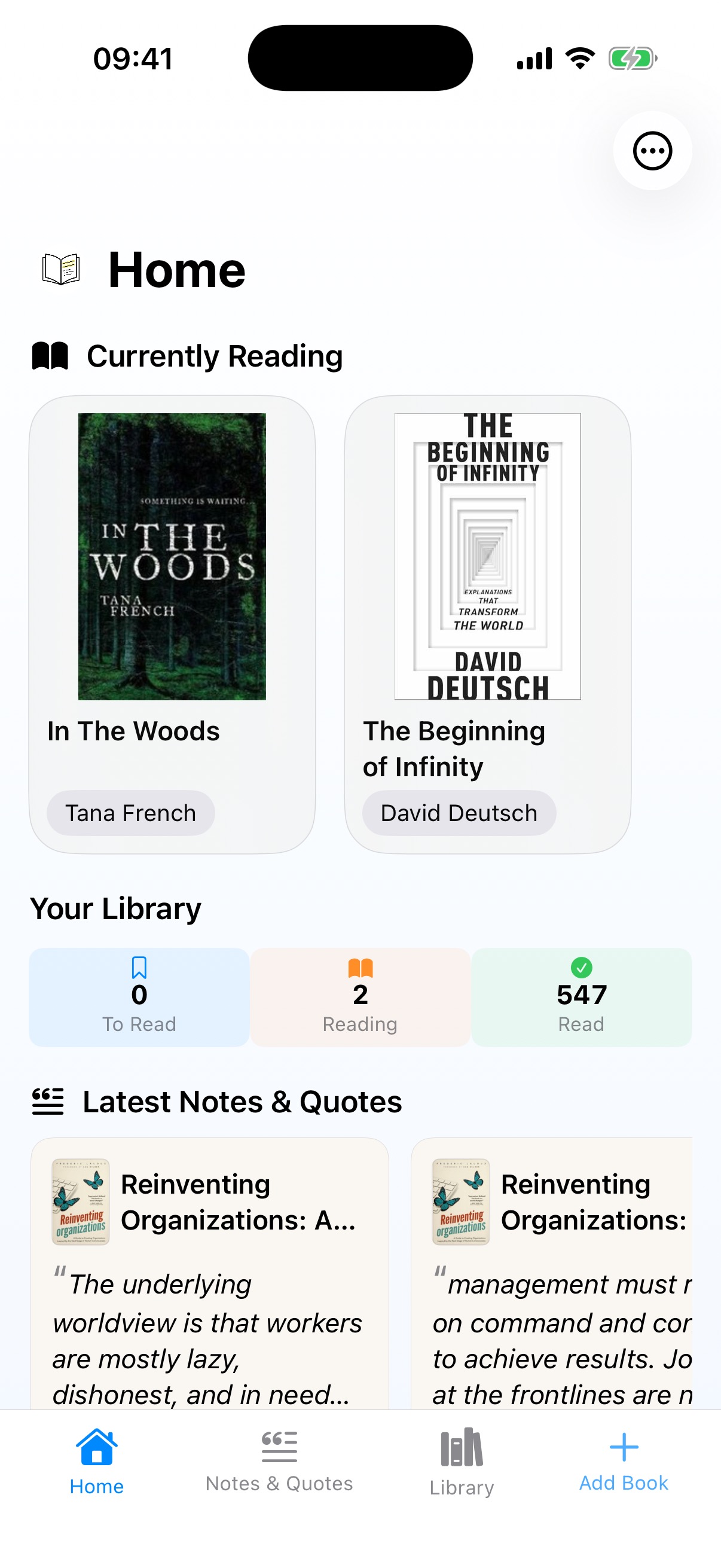
Marginalia v1: The Honest Ugly
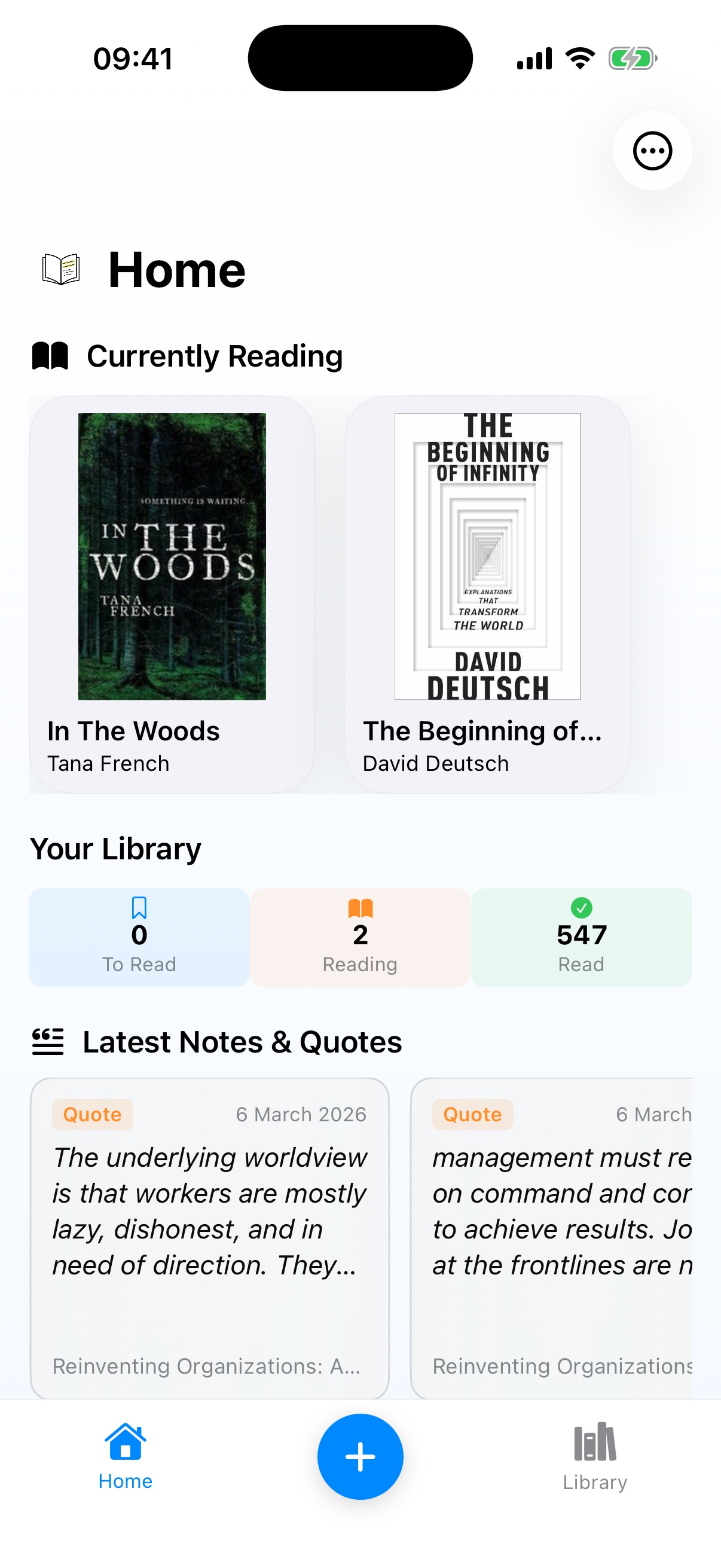 Home
Home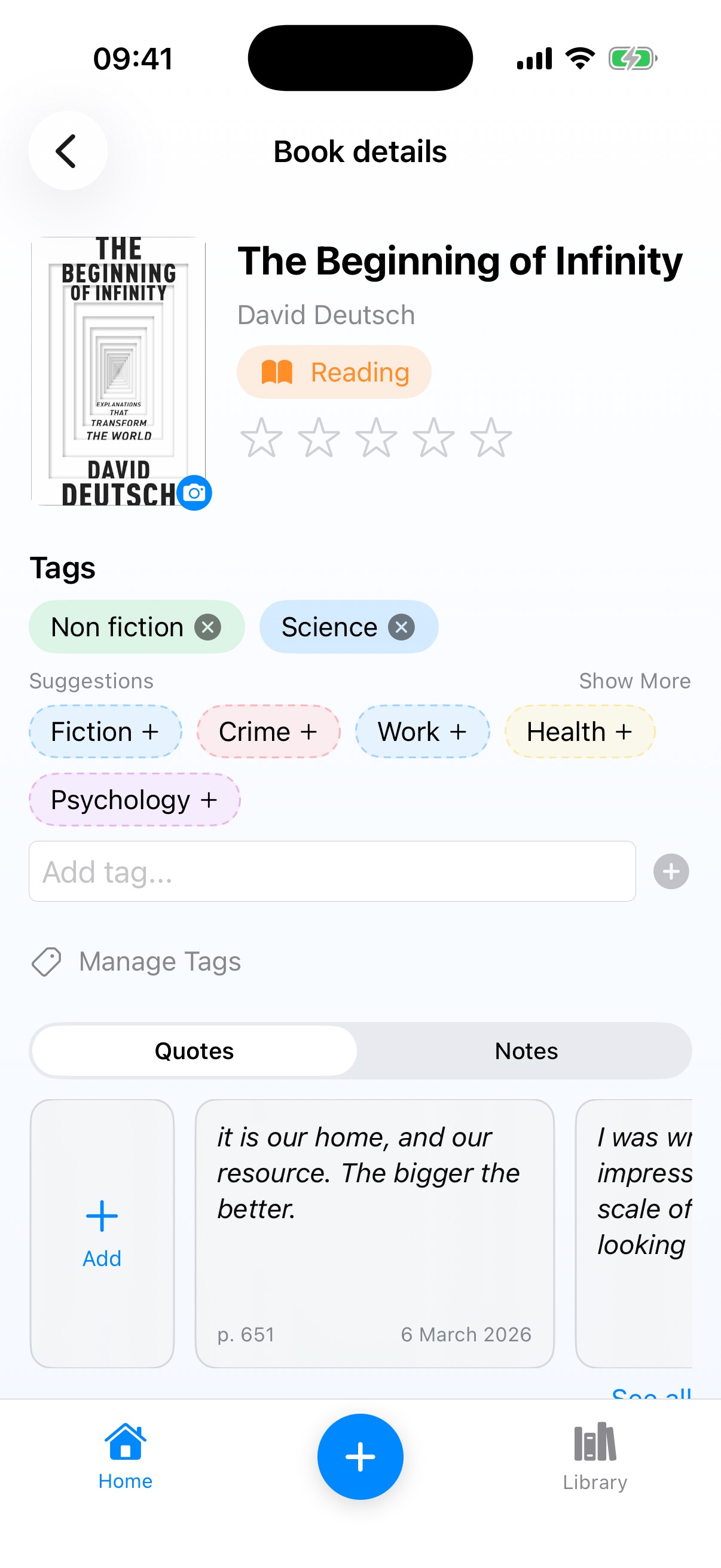 Book Detail
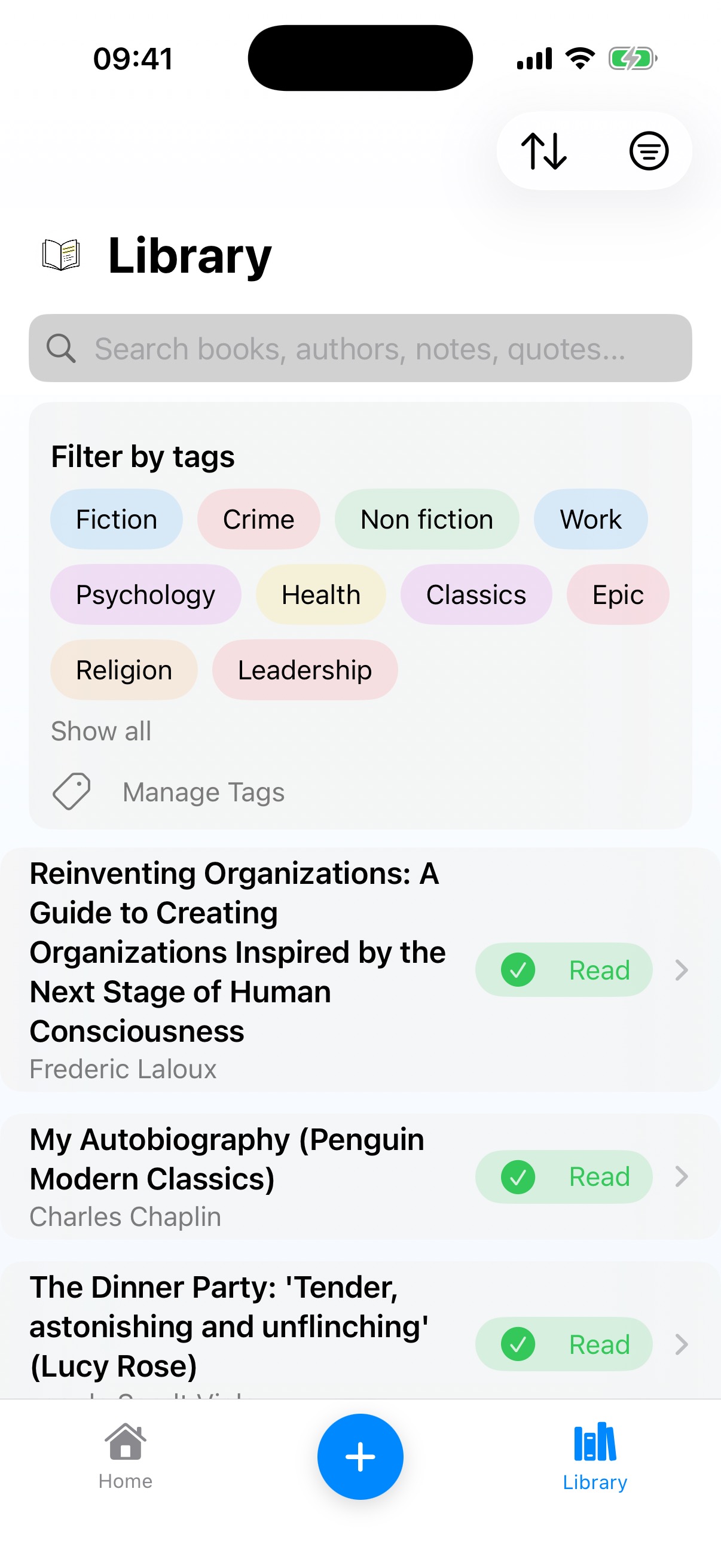 Library
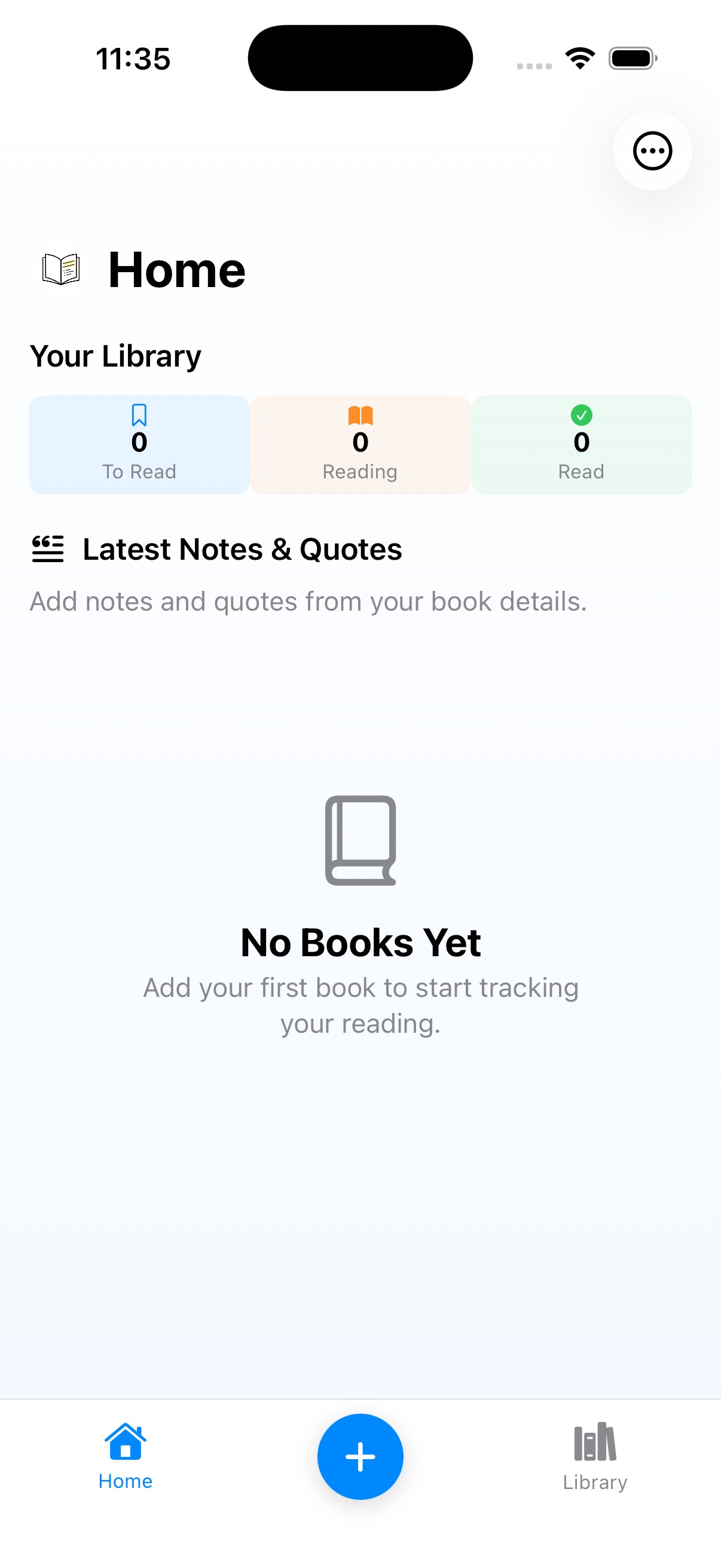
Version 1 did what the name promised. A Home screen with your currently-reading books, a counter for your library stats, and a feed of notes and quotes at the bottom. The Library was a plain text list with title, author, and status. Two tabs at the bottom with a big blue “+” button floating in the middle.
The blue “+” button is worth dwelling on because it survived for four versions. It was functional, sure, but it was also oversized, jarring, and completely unbalanced against the rest of the UI. I didn't keep it because I thought it was good. I kept it because I'd stopped seeing it. When you stare at your own app every day, the ugly parts just become part of the landscape and you stop questioning them.
Then there's the Book Detail screen, where I had an “Add” card sitting inline alongside actual quote cards. A piece of UI chrome pretending to be content. I'd copied the pattern from other apps without really questioning whether it made sense here, which is a different kind of blindness: imitation substituting for thinking.
The Quotes/Notes Visual Mess
Even in v1, the seeds of a problem I wouldn't fully solve until v3 were already visible. Quotes got italics and an orange “Quote” tag. Notes got the same card style with a “Note” tag. Both lived in a segmented tab control on the Book Detail page.
What I missed was that the way a quote rendered on the Home screen didn't match how it looked on Book Detail. Two different visual treatments for the same piece of content. I was building inconsistency into the app from day one and didn't notice, because I was always looking at one screen at a time rather than the whole system. I could tell you that “design consistency matters” and I'd have agreed with that statement at any point during development. But knowing it and catching it in your own work are, apparently, completely different things.
Lectr v1.6: Now Called Lectr
 Home
Home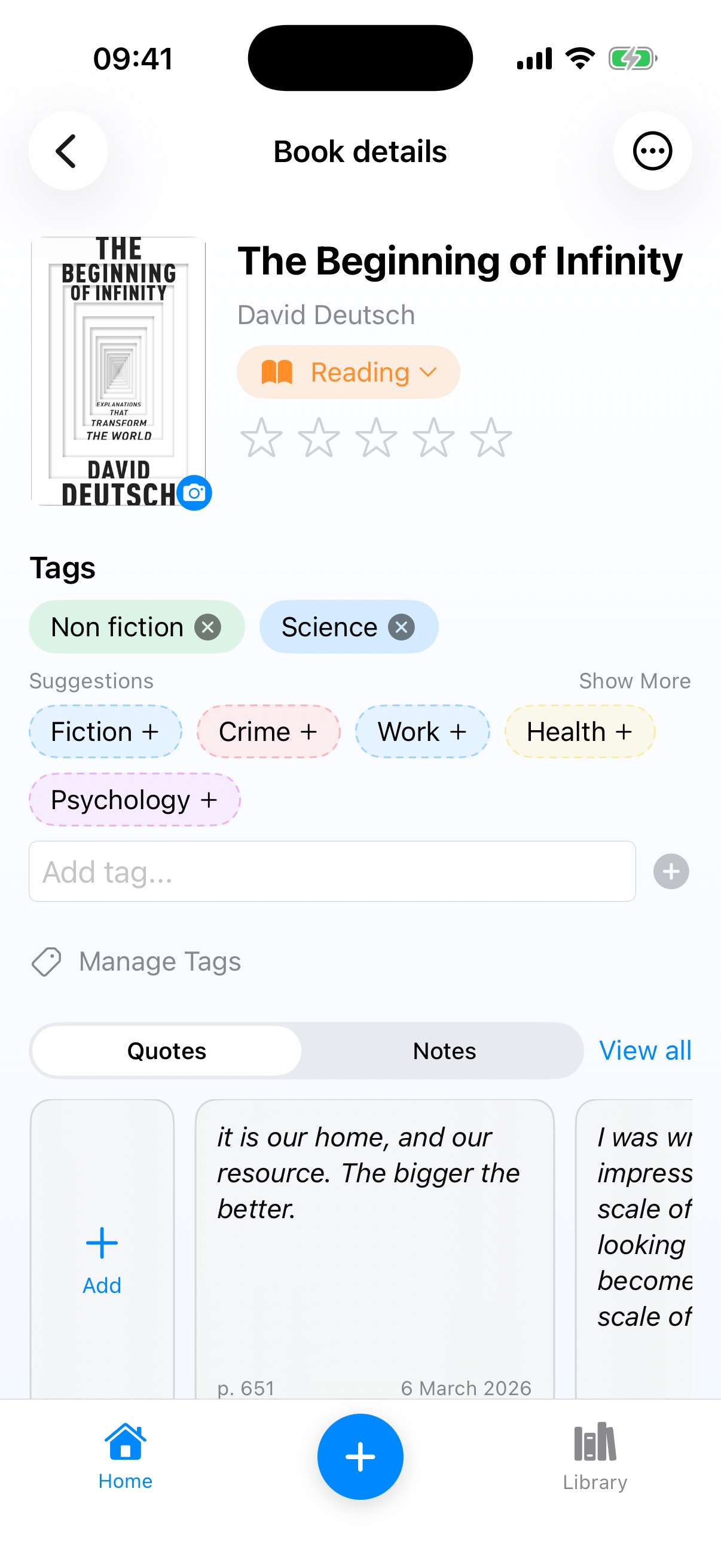 Book Detail
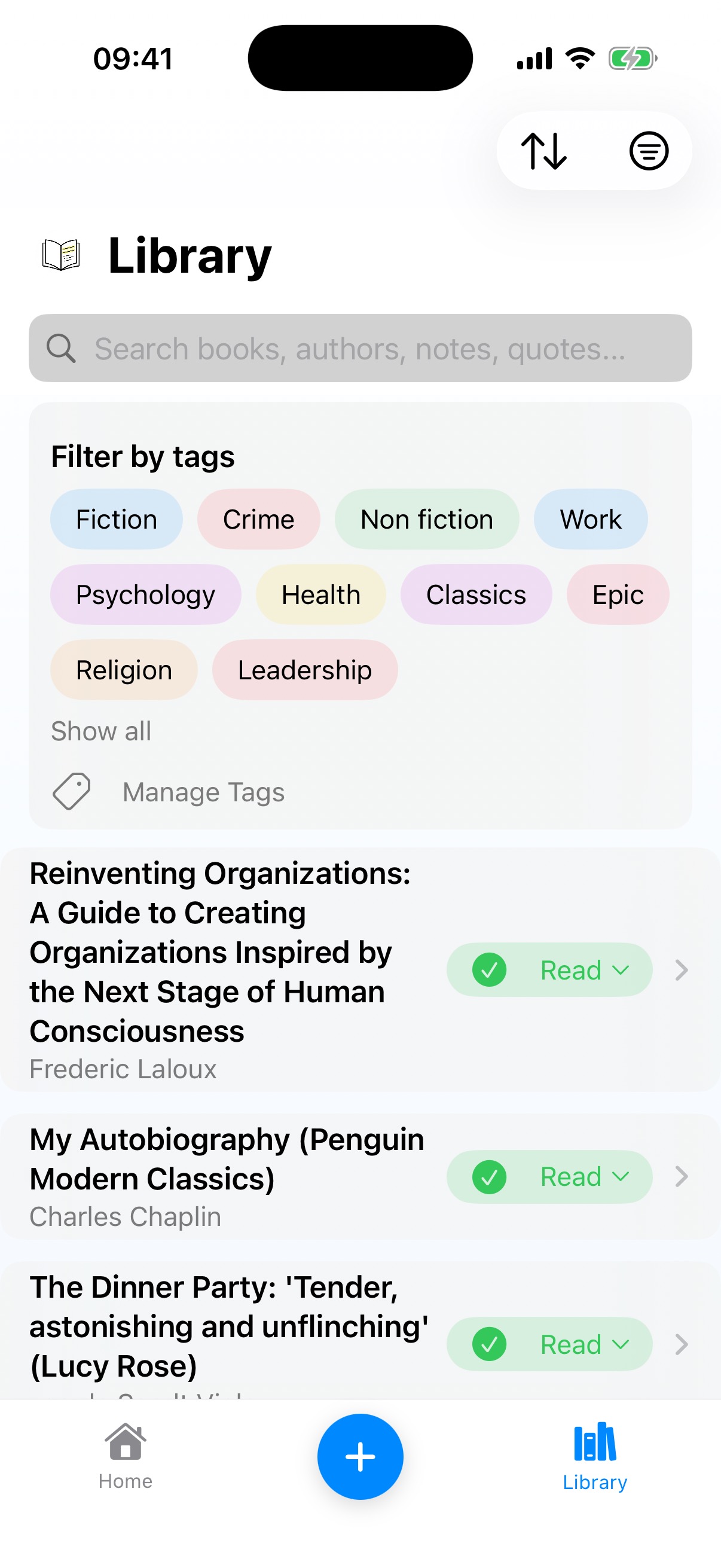 Library
The rename happened here. Same app, new name. But v1.6 also introduced something interesting that wasn't really a design decision at all: the “Checking for your books...” iCloud sync screen. Sometimes functionality dictates design. You've got a cloud-synced database and the user needs to know the app is doing something, not that it's broken. So you build a loading state. It's not glamorous, but getting it right is its own kind of craft.
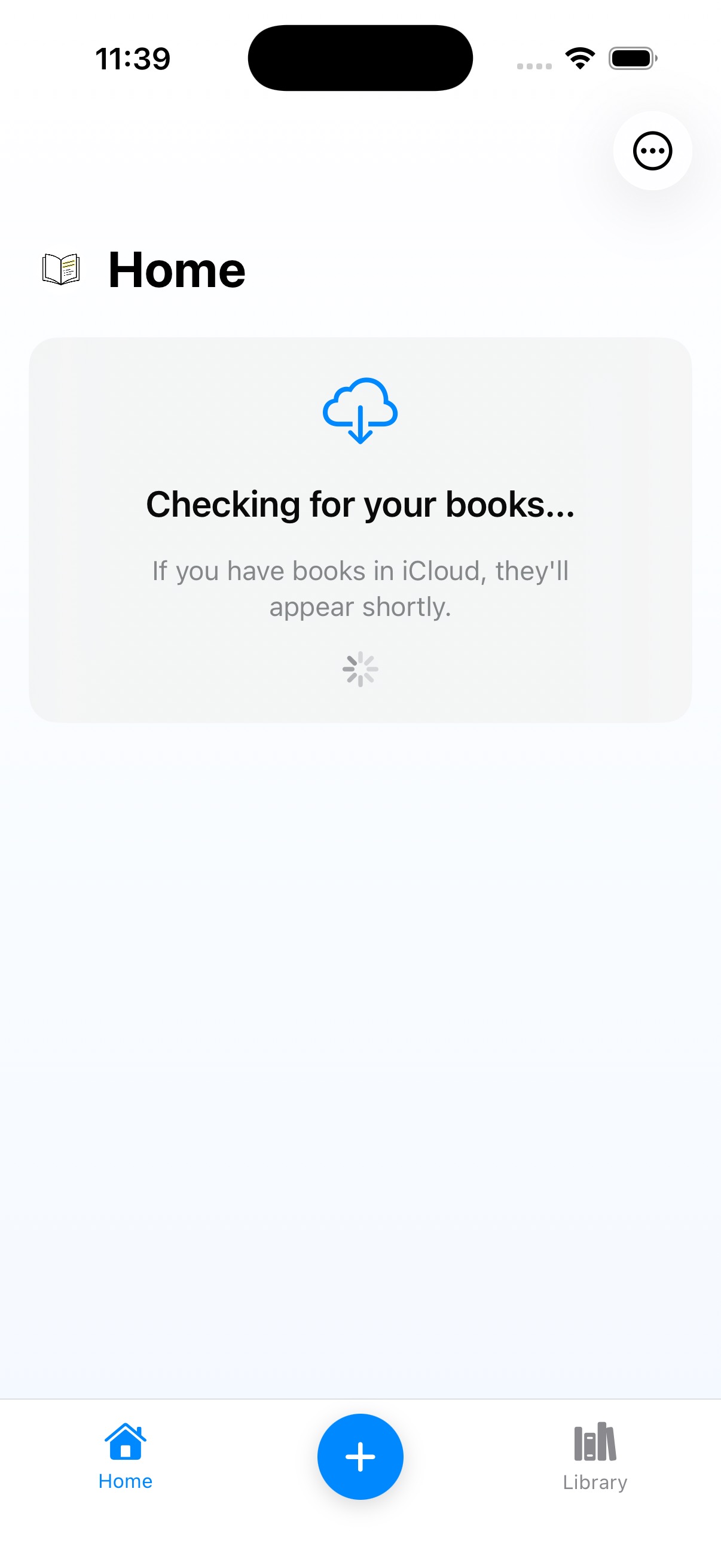 Checking for your books...
I also still had that segmented Quotes/Notes tab control, and I was wilfully blind to how ugly it was. “Invented here” syndrome: I'd built it, so I liked it. Looking at it now, with competing controls and unclear information architecture, it's genuinely hard to understand how I didn't see the problem. But that's the thing about blindness through familiarity: you don't notice what you've stopped looking at.
Lectr v2: I Discover Images
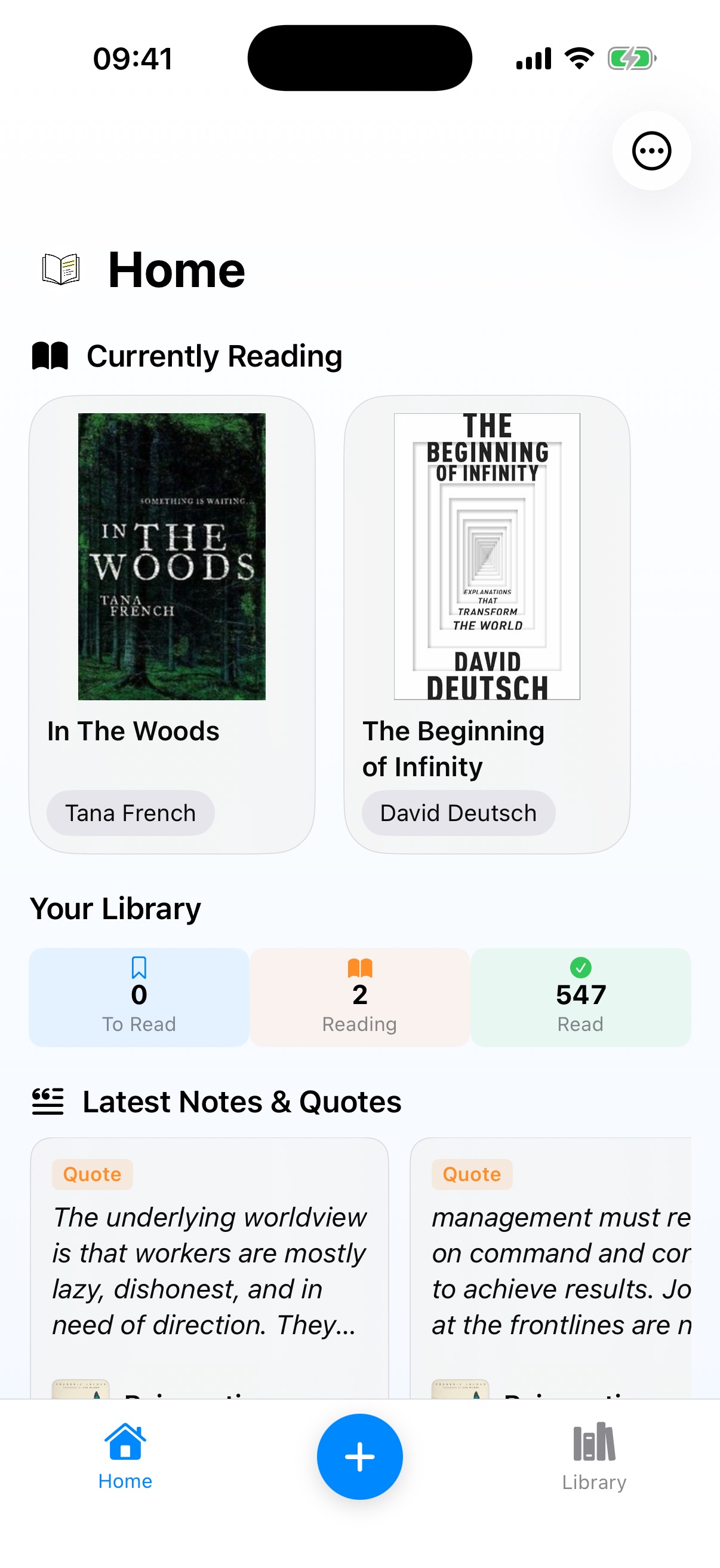 Home
Home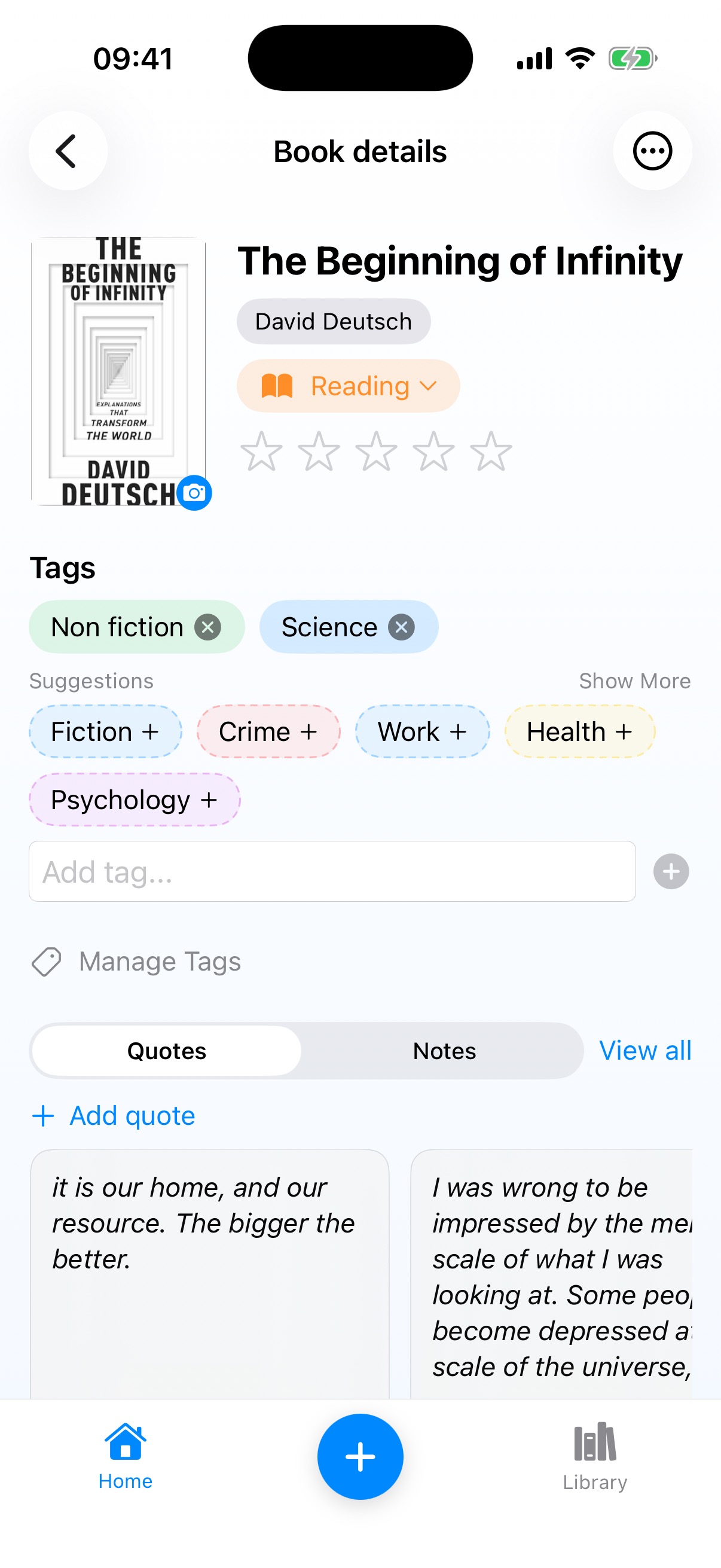 Book Detail
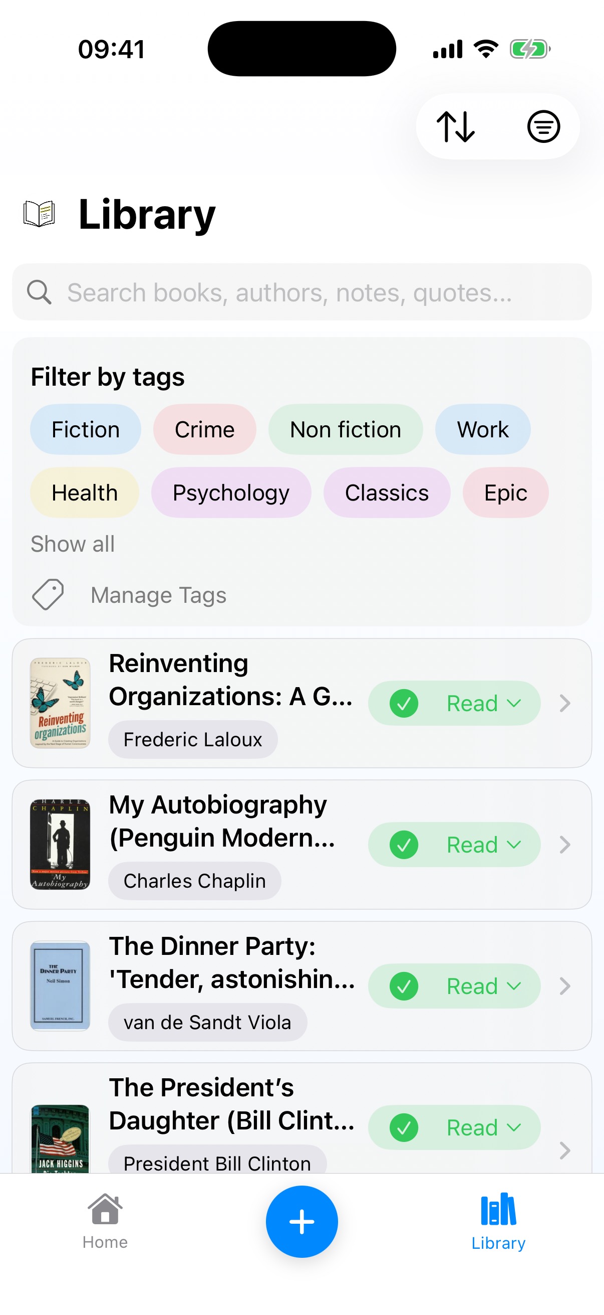 Library
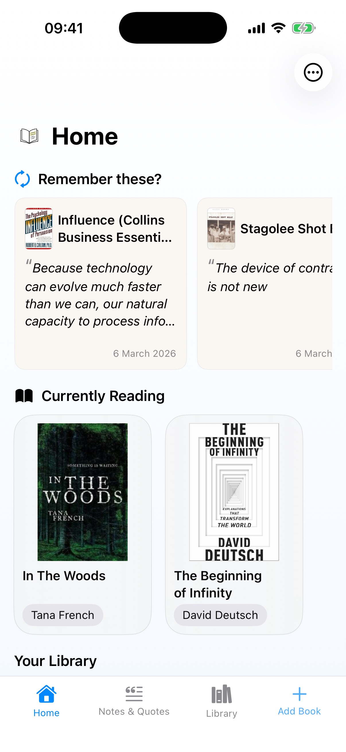
I'm a words person. I think in text, and for the first three releases the app reflected that: the Library was a pure text list with no book covers. It took until v2 for me to add cover images in the Library, and the moment I did the screen went from spreadsheet to bookshelf. A designer would have started there. I had to arrive slowly, because my instincts as a builder didn't match what users needed.
The same version introduced author names in neat pills beneath covers on the Home screen, and replaced that awful inline “Add” card with a simple “+ Add quote” text link. Small moves toward letting the content breathe. The quote/note visual inconsistency though? Still alive and well.
Lectr v2.1: The Structural Shift
 Home
Home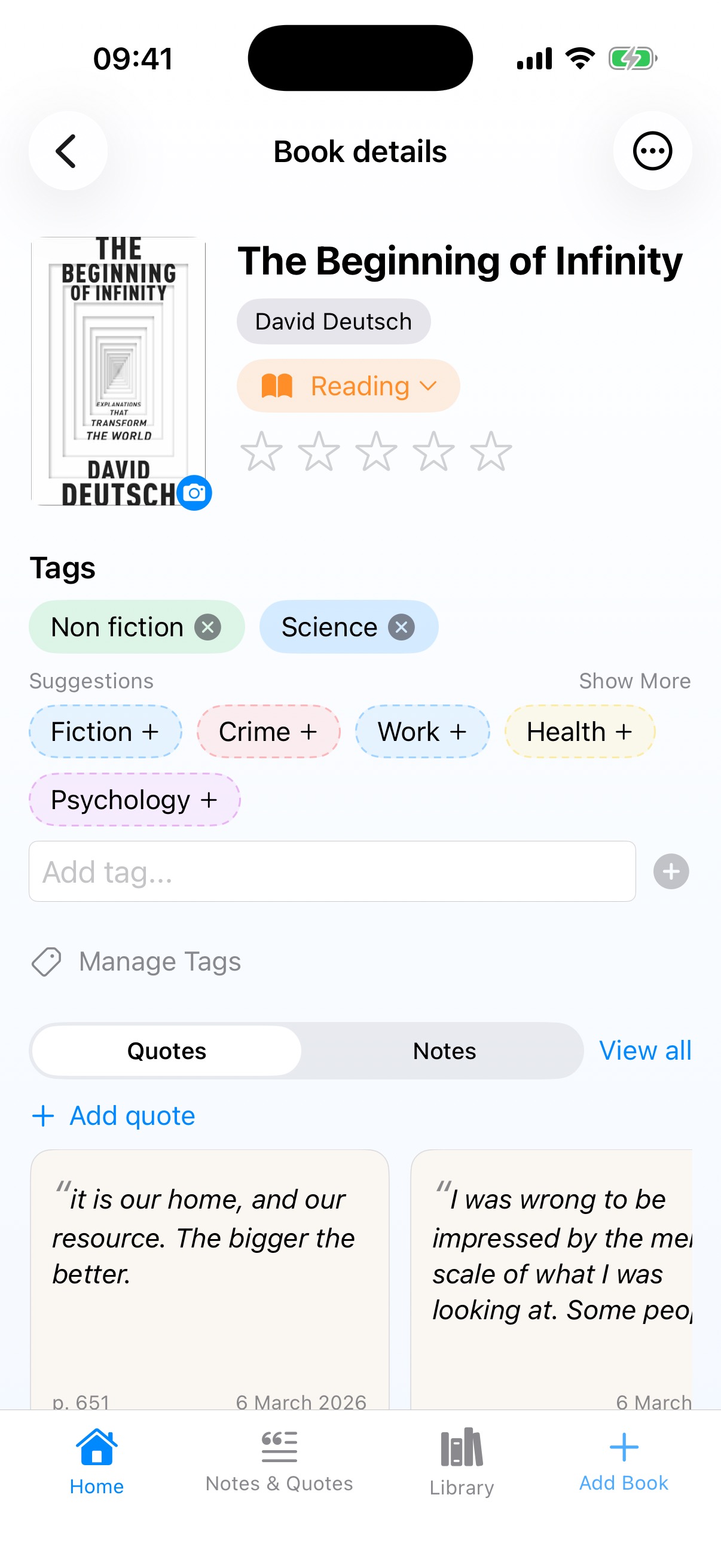 Book Detail
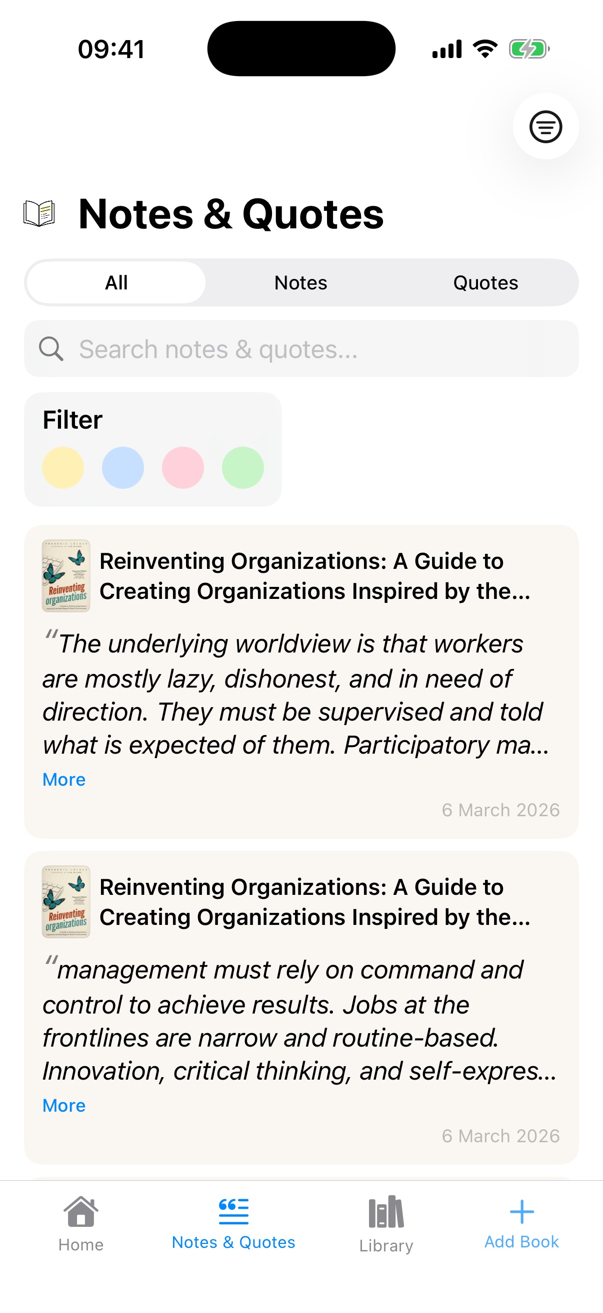 Notes & Quotes
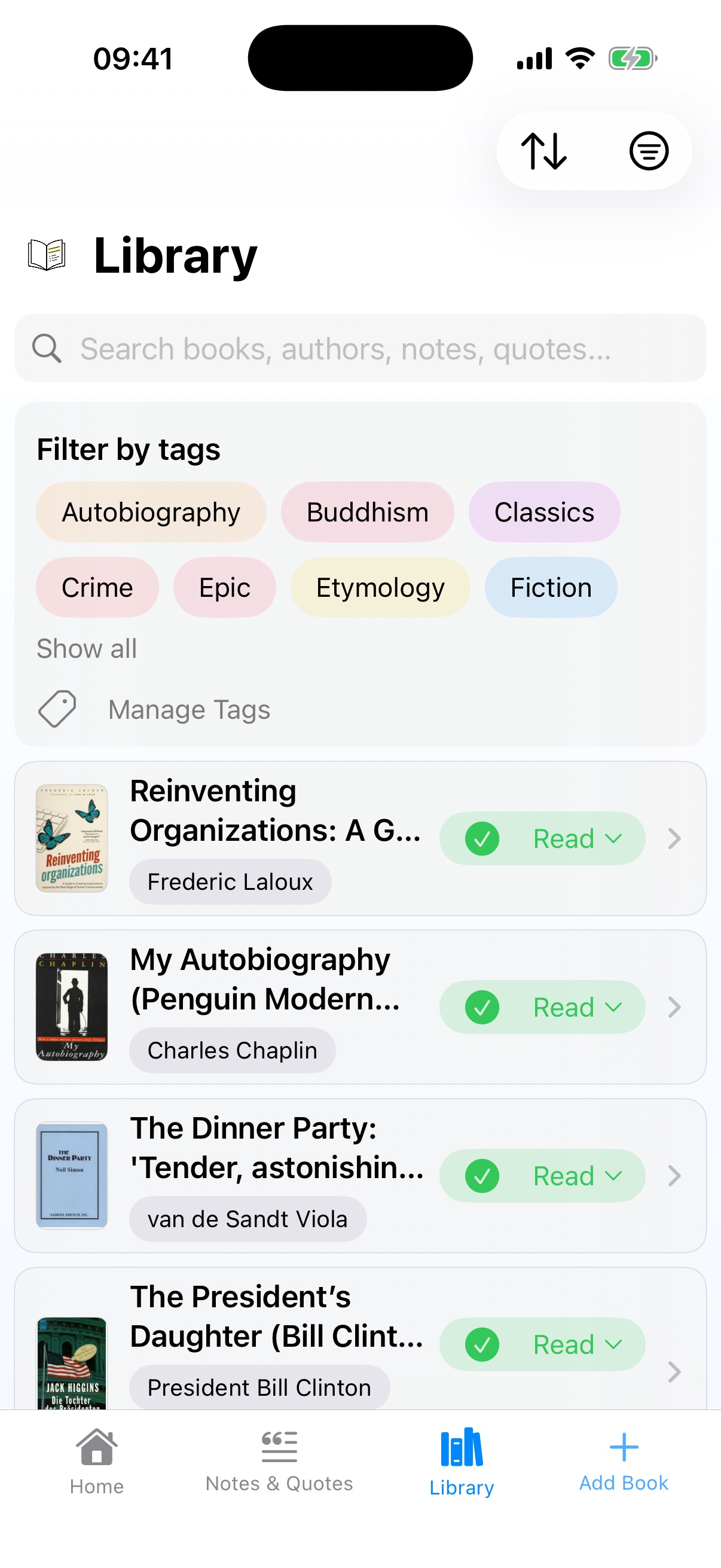 Library
This was the release where the app's architecture actually changed. The floating blue button finally died (four versions too late), replaced by a four-tab navigation: Home, Notes & Quotes, Library, Add Book.
The bigger change was giving Notes & Quotes its own dedicated screen, which came directly from using the app myself. One of Lectr's features is importing your Kindle highlights, and I'd imported years of them from a Kindle 3 I'd had since around 2010. We're talking over a decade of passages I'd highlighted across hundreds of books, all sitting in a My Clippings file that I'd never had a good way to browse. Once they were in the app, scrolling back through them, rediscovering ideas I'd completely forgotten about, was genuinely exciting. I wanted that browsing and discovering experience to be a first-class part of the app, not something buried three taps deep inside a book detail page.
With it came the colour-coded filter dots. The metaphor was “post-it notes,” because I wanted filtering to be that simple. Four colours, tap to filter, and it works well enough. But it didn't solve the underlying problem I was about to run into.
The Volume Problem
Some books generate a lot of quotes. Reinventing Organisations: 144 quotes. (I really loved that book.) On the Notes & Quotes page, that's not a curated collection, it's an overwhelming wall of text. I'd assumed filtering would be enough. It wasn't. Colour tags help you find a type of quote, but they don't help when the sheer quantity makes the page unusable. When you've imported fifteen years of highlights, volume isn't an edge case, it's the default experience.
This was a problem I wouldn't properly solve until v3.
New Visual Language, New Inconsistency
v2.1 did introduce something genuinely good: a leading curly quote mark as a visual hint for quotes, plus a different card colour for notes (no leading quote, no italics). For the first time, you could tell at a glance whether you were looking at a quote or a note.
But I'd also created a new inconsistency. The cards on Home now looked different from the cards on Book Detail. I'd fixed one problem and created another. The pattern across every version was the same: improve one surface, break consistency with another, because I was always designing screen-by-screen instead of thinking about the whole system. I knew consistency mattered. I'd have said so if you'd asked. And yet here I was, several releases in, still creating new inconsistencies while fixing old ones.
Lectr v3: Seeing the Whole Board
 Home
Home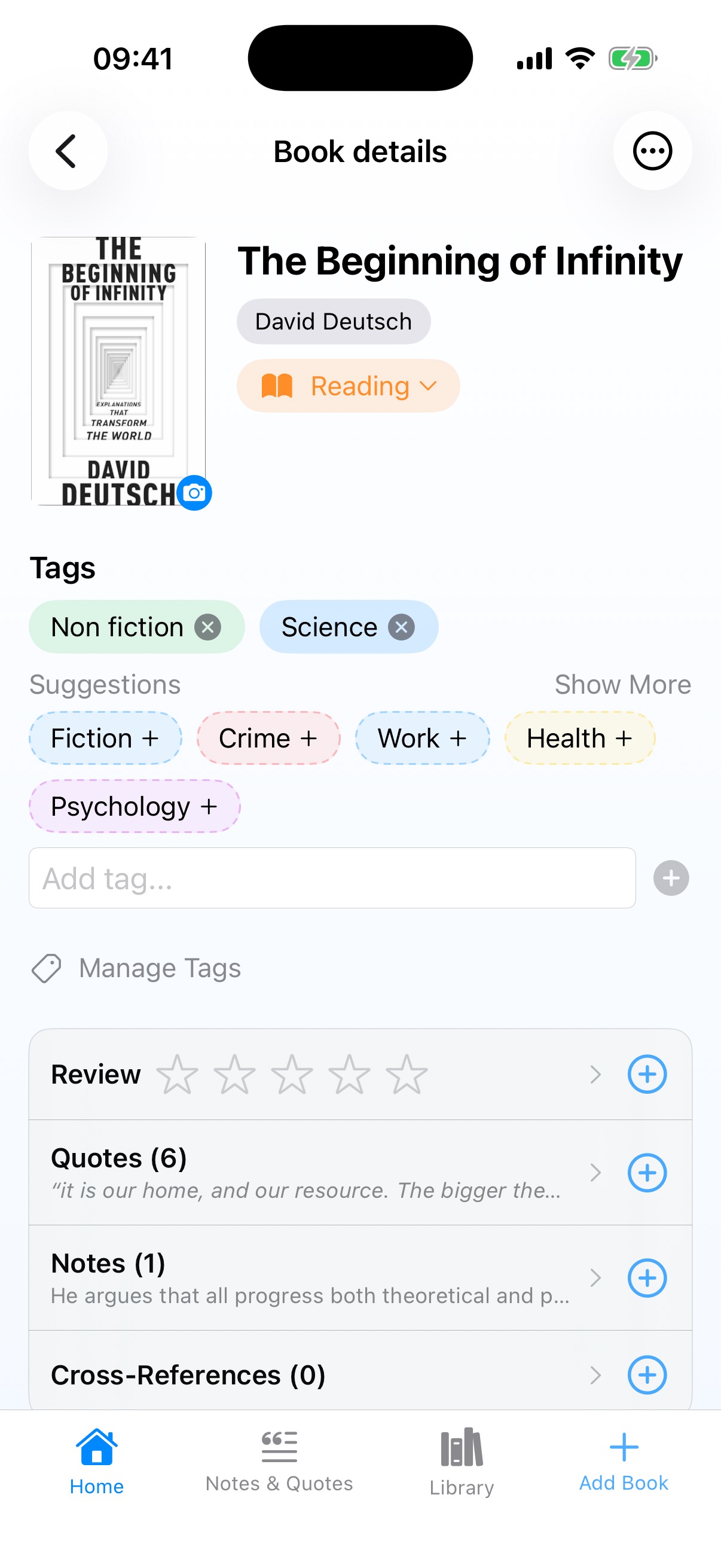 Book Detail
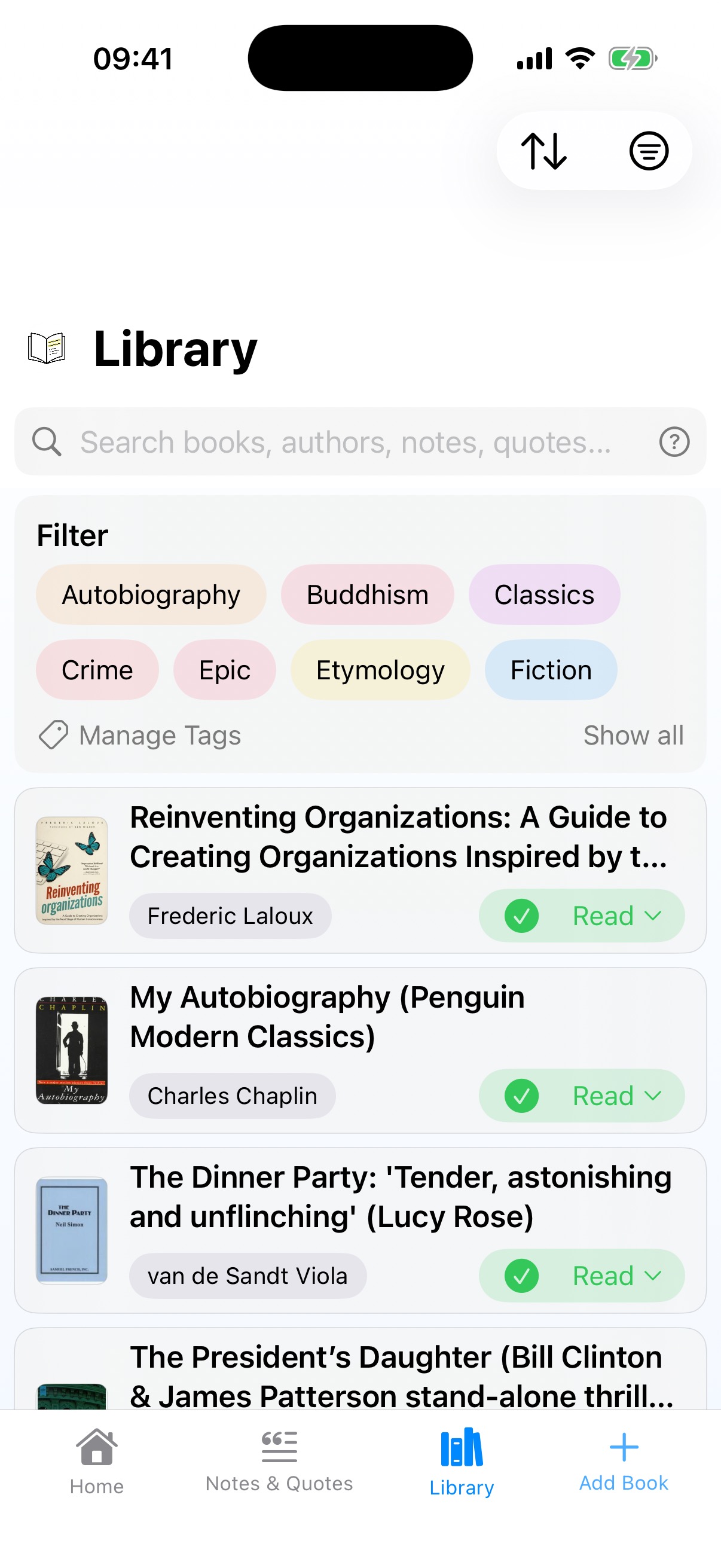 Library
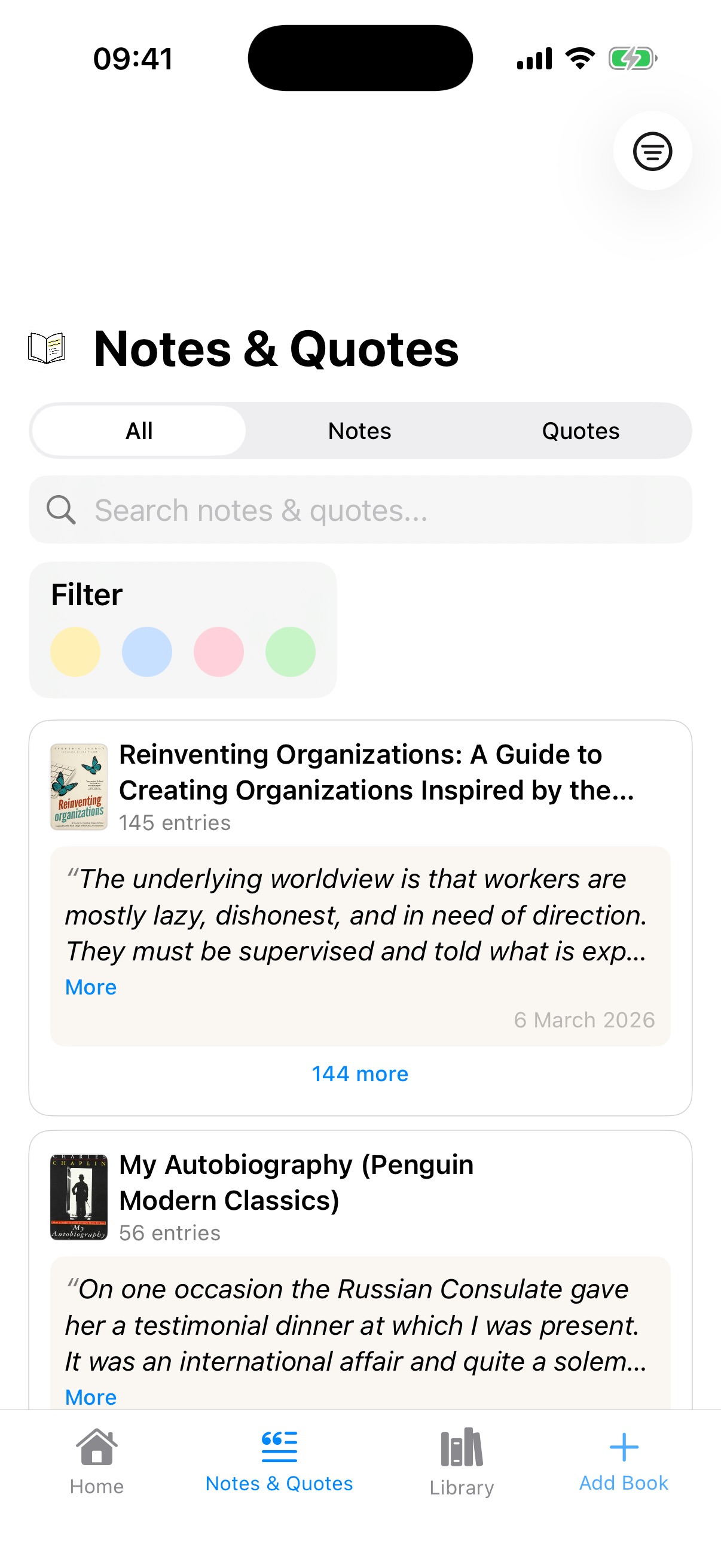 Notes & Quotes
v3 is where several of these threads finally come together, and where I feel the app started to properly mature.
Note piles solved the volume problem. Instead of dumping 144 quotes into an infinite scroll, they're grouped and stacked, each book showing as a collapsed card with a count like “145 entries.” But the piles alone weren't enough. I kept using the app and kept getting irritated every time I expanded a big pile and got lost scrolling through it. That irritation was a useful signal, and I've learned to pay attention to it rather than rationalise it away. It's the same feeling that eventually led me to add bulk actions like delete and tag.
So I kept iterating. The solution was a sticky header: when you expand a pile and scroll deep into a book's quotes, the book title and a close button pin to the top of the screen. You always know where you are and you always have a way out. Tap close and you're back to the collapsed view. It's a small piece of interaction design, but it's the difference between a screen that works in a demo with three quotes and one that works in real life with 145.
The Book Detail page got a complete restructure with Review, Quotes, Notes, and Cross-References as clean expandable rows with counts. It has more functionality than any previous version, but it actually feels calmer and easier to scan. I was trying to add features while reducing visual noise, and I think it mostly works.
Quote and note rendering finally reached consistency across all surfaces. It took the first releases I shipped to the App Store to converge on a unified visual language, because consistency isn't a decision you make once. It's something you arrive at through repeated failure, noticing one more place where things don't match and fixing it, then noticing the next one.
And there's the contextual search help, a little overlay that explains search
operators and shows you things like missing:cover or missing:rating.
I like it. It's arguably too subtle for users to discover, but it rewards the people who find it.
Empty States: The Screens You Forget
 v1 Homev1.6 Home
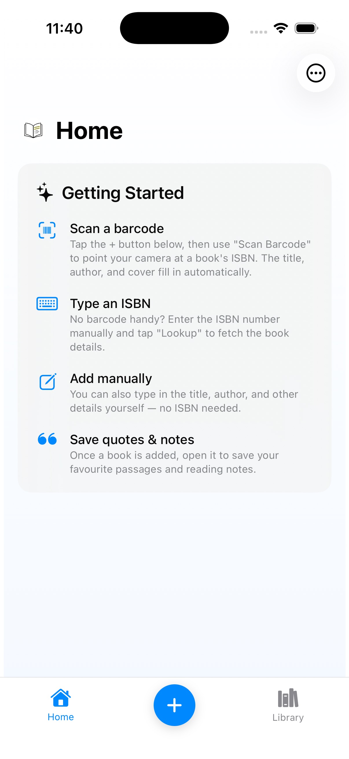 v2 Getting Started
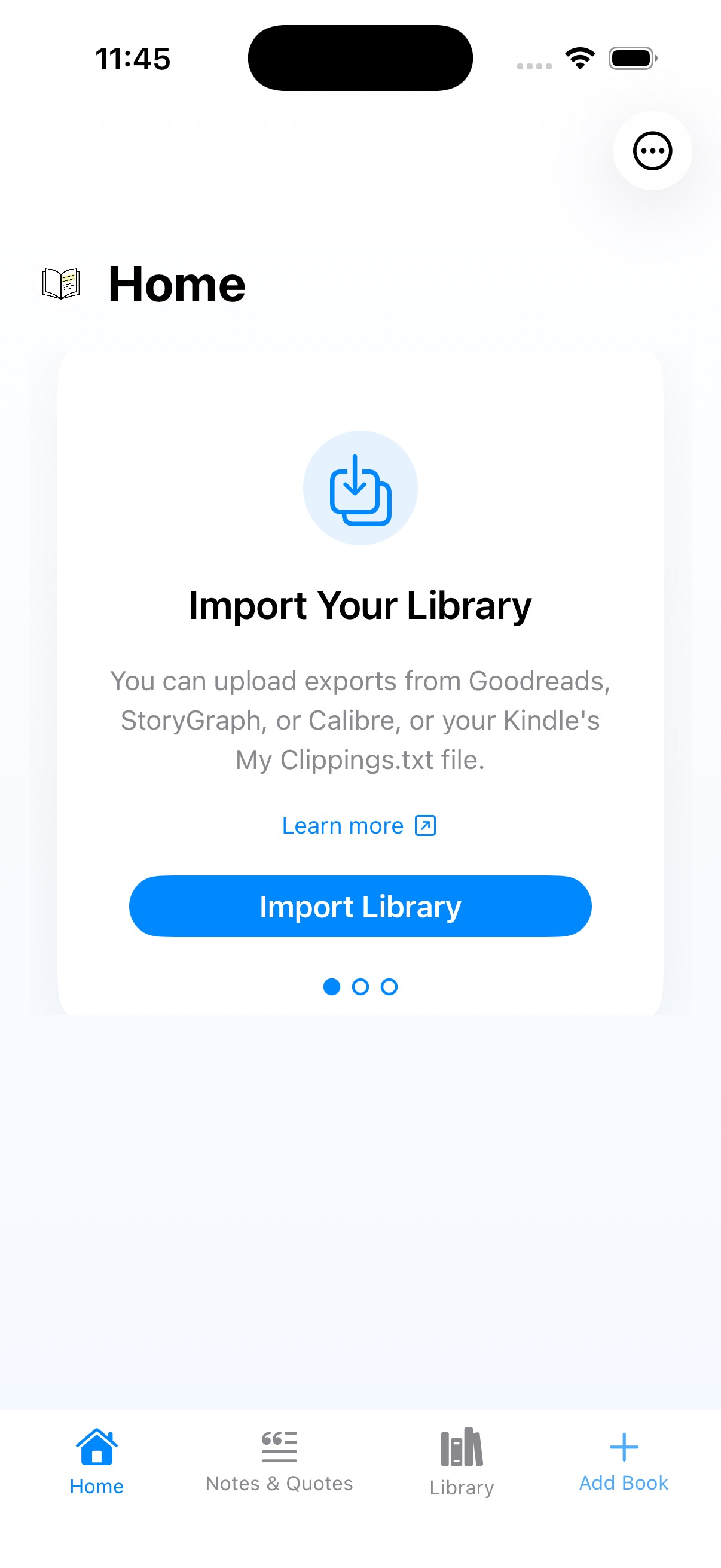 v3 Import Library
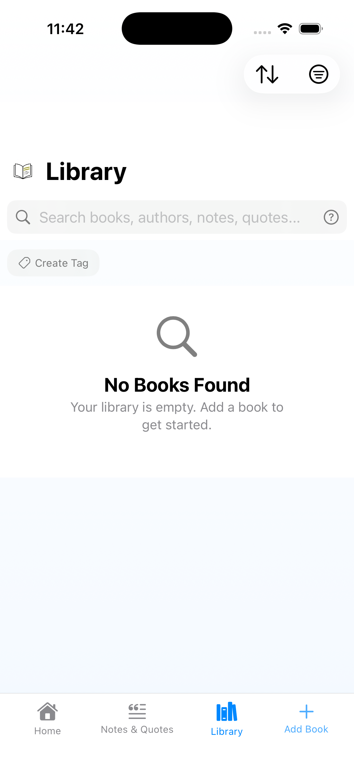 v3 Library
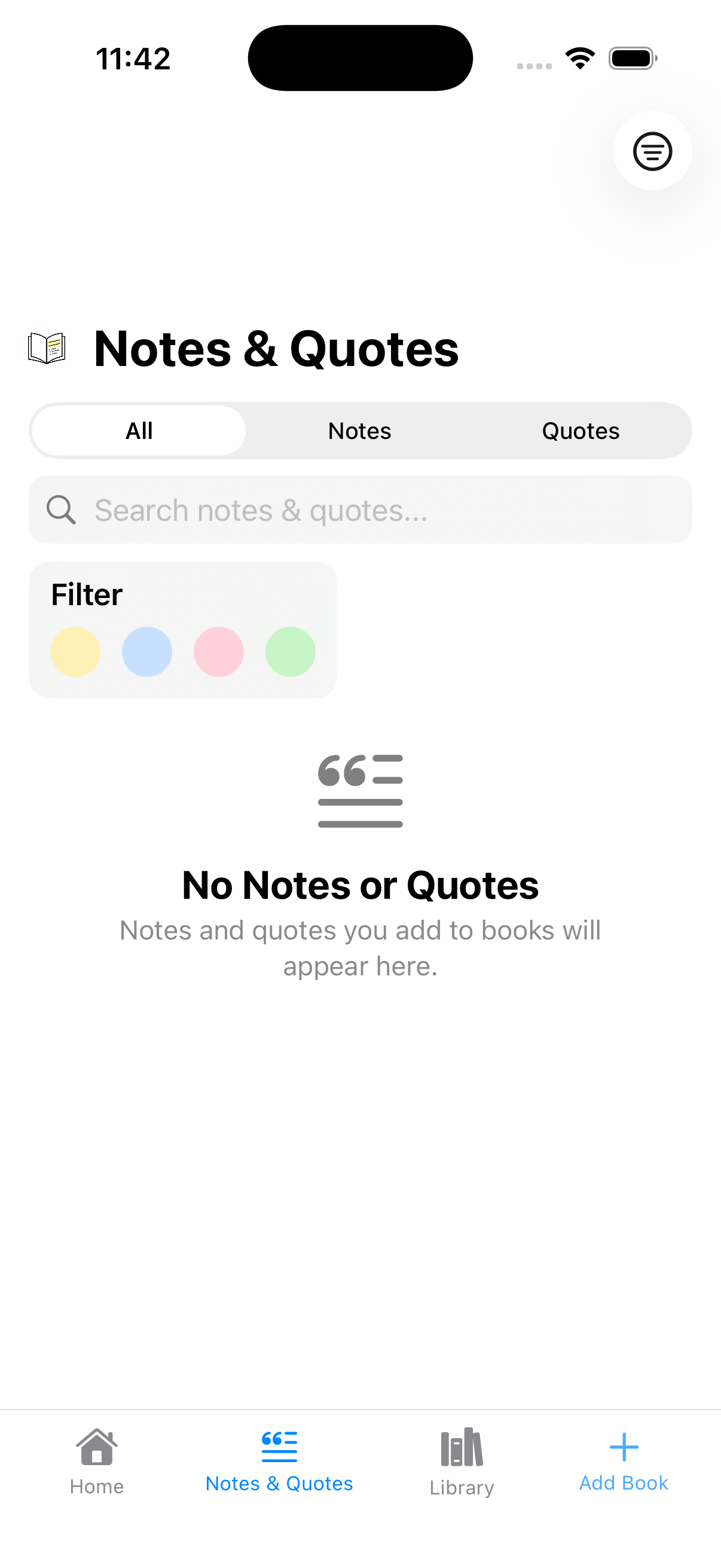 v3 Notes & Quotes
Every developer knows how often a polished design (which I'm not claiming mine is) misses the inevitable empty states, offline states, error states, and so on. But empty states are particularly important. That's the first thing our users will see, and if we get it wrong it might be where they leave us. It's also where I see my worst instincts at work.
v1: “No Books Yet. Add your first book to start tracking your reading.” Job done, empty state handled, check the box and move on.
v1.6: Added iCloud sync, so now there's a “Checking for your books...” loading state. Slightly more sophisticated, but mostly driven by technical necessity rather than design thinking.
v2: This is where I should cringe. The Getting Started card is a wall of copy. Scan a barcode, type an ISBN, add manually, save quotes and notes. Four dense paragraphs of instructions in small text. I know from my professional experience that users don't read copy on screens. Especially not a wall of it in a small font. I know this. I've told other people not to do this. And I did it anyway. This is 100% me: making mistakes I know better than to make, because knowing something intellectually and applying it to your own work are apparently two completely different skills.
v3: An onboarding carousel with Import Your Library, Add Your First Book, and Capture Your Thoughts. Cleaner, more visual, broken into digestible steps, and a genuine improvement. But the “Add Your First Book” card tells you what to do without telling you how. There's no arrow pointing to the Add Book tab, no visual breadcrumb. I know the app so well I forgot the user doesn't. That blindness through familiarity keeps coming back.
And then there are the Library and Notes & Quotes empty states. Library shows a grey magnifying glass and “No Books Found” — technically accurate, completely uninviting. Notes & Quotes is worse: it kept the search bar, filter dots, and segmented control all visible on an empty screen, with a grey icon buried underneath. I also didn't spot until putting these screenshots side by side that Notes & Quotes was missing the blue gradient background that Library had. The kind of inconsistency that's invisible when you look at one screen at a time but obvious the moment you lay them next to each other. They're functional, but they're also pig ugly and I know it.
What This Process Taught Me
I'm not a designer. But looking back across the first releases I shipped to the App Store, the improvements that actually mattered didn't come from learning new principles. They came from using the app, noticing what irritated me, and eventually trusting that irritation enough to do something about it. The Notes & Quotes tab exists because I felt the pleasure of rediscovering old highlights and wanted that to be easier to reach. The sticky header exists because I kept getting lost in long quote lists and refused to accept the experience. Bulk actions exist because I got tired of doing housekeeping actions one at a time. Every real improvement started with use.
If there's a useful takeaway here, I think it's this: the gap between knowing the right thing and doing the right thing doesn't close by reading more articles or studying more UX patterns. It closes by using what you've built, paying attention to when it frustrates you, and being honest enough to act on that rather than explaining it away. Dogfooding isn't just a nice-to-have. For a solo developer without a designer, it's basically the whole design process.
Git tags are your forensic toolkit. This is basic stuff, not a revelation. I tag every release and have a CI/CD pipeline that uploads builds to the App Store from those tags. The only reason I'm mentioning it is that without tagged releases, this whole exercise wouldn't have been possible. Your ability to learn from your own history depends on having a history you can actually retrieve.
You can't see your own app, but you can feel it. You develop a visual blindness to things you see every day, but the irritation of actually using a bad interaction doesn't fade the same way. That irritation is the signal. The mistake I made repeatedly was noticing the feeling and not being confident enough in its value as a signal.
Empty states are the real first impression. Everyone knows this. I knew it too, and I still shipped a Getting Started card that was a wall of tiny text because I was more interested in building features than polishing the screen new users actually see first.
Consistency is convergent, not declarative. By v3, quotes and notes finally look the same everywhere, but it took multiple releases of fixing one surface while accidentally breaking another. That's the bit the theory doesn't prepare you for.
Use is the design process. I built this gallery to write a blog post, but the gallery turned out to be more useful than the post. Not because it showed me new problems, but because it made visible the pattern I'd been living inside: every meaningful improvement in Lectr came from using it and refusing to accept the things that annoyed me. The theory was always there. What was missing was the accumulated irritation that eventually made me act on it.
— John
P.S. I Took My Medicine
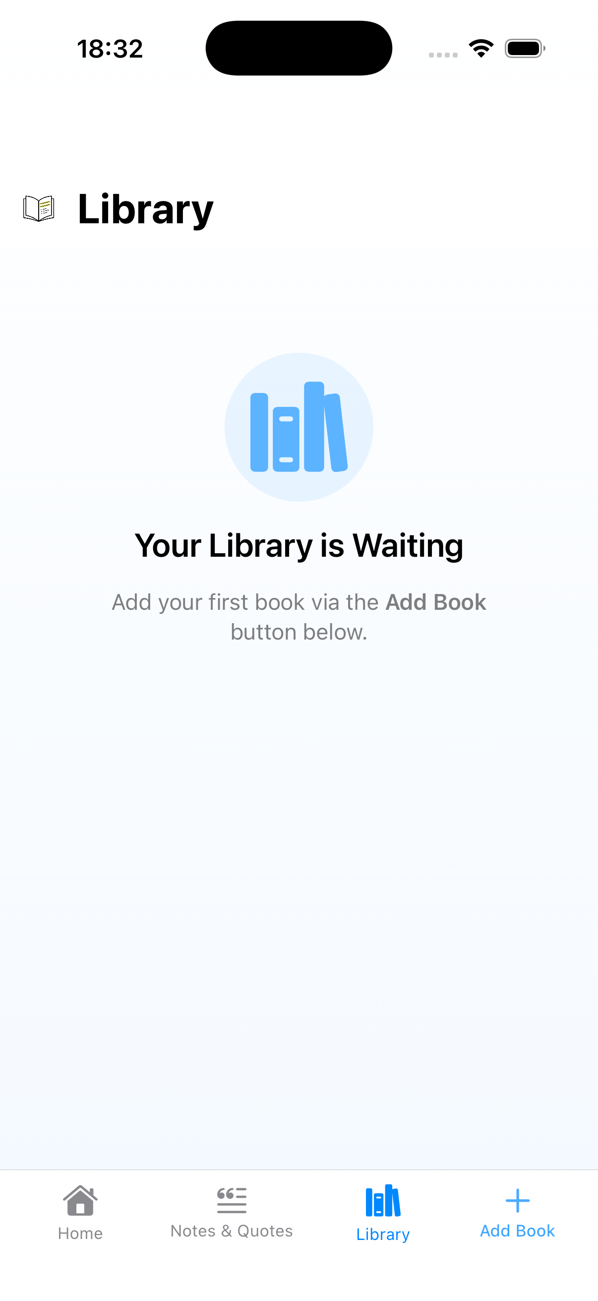 Library
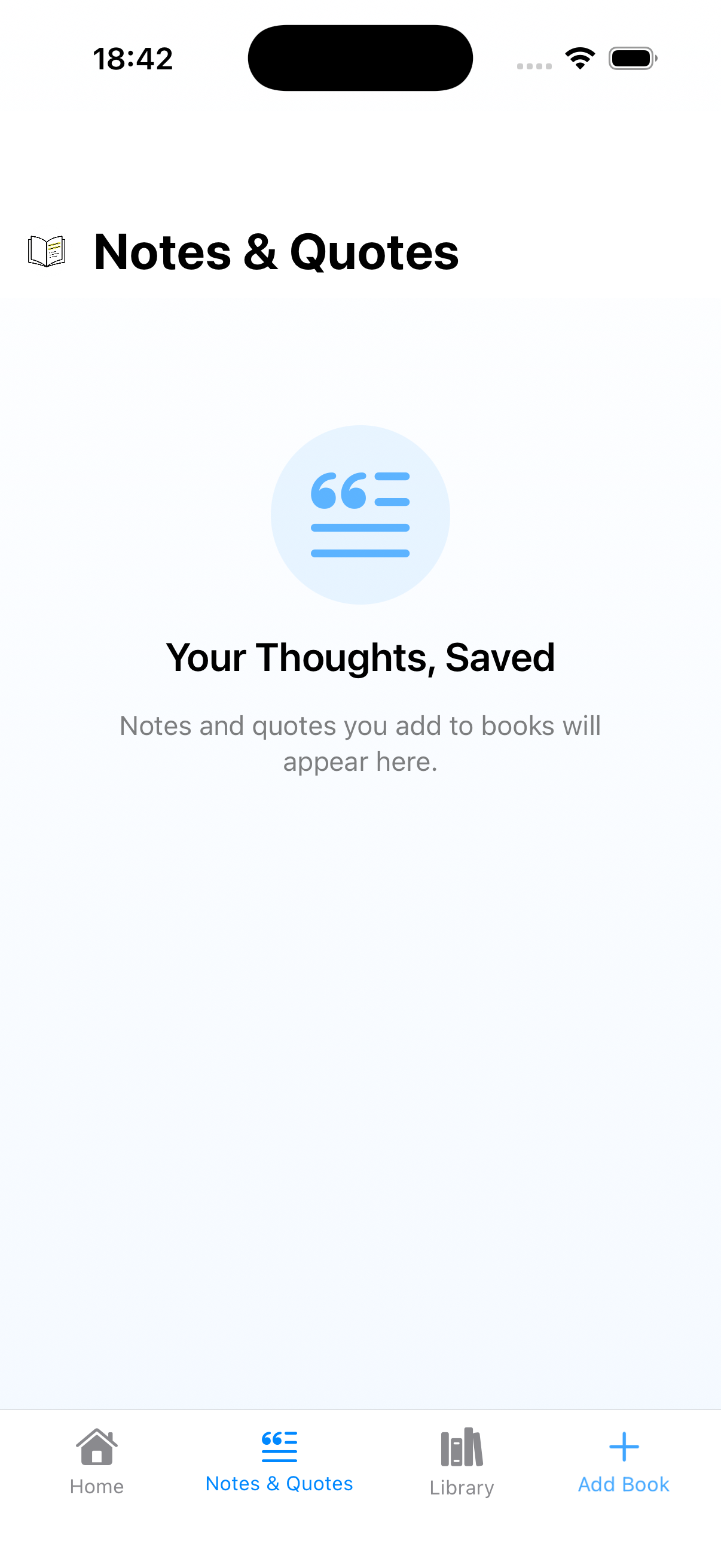 Notes & Quotes
Writing this post about empty states provoked something stronger than the usual irritation. Actual embarrassment. Calling something “pig ugly” in public and then leaving it that way turns out to be a pretty effective motivator. Apparently embarrassment is another useful signal, right alongside irritation.
Lectr is a reading notebook for iOS. Private, offline, no subscription. Android - coming April 2026.